June’s Exit is Your Chance to Upgrade.
Jul 24, 2025
The Accoil Team
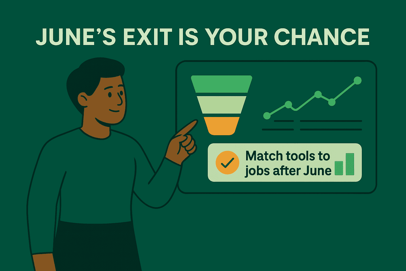
With June going away on August 8, founders, product managers, and team leads need a plan, fast.
But before we talk about your options, let’s give June the credit it’s earned.
It did two things exceptionally well:
It made product analytics simple. No tracking plan rabbit holes. No analyst bottlenecks. Just plug in Segment (or JavaScript) and boom — you had real metrics.
It made customer health visible. Not at the user level. At the account level. That meant you could actually see if an account was drifting, spiking, or silently churning — without waiting for a spreadsheet.
That combo — lightweight product analytics + meaningful B2B account insights was rare. And powerful.
As you weigh June alternatives, it’s worth pausing to ask:
What job you are trying to get done now that June has gone away?
Start here: What data do you need to see to do your job?
When we speak to June users, most use either lightweight product analytics or B2B account insights.
If you were a June customer, which job below best describes how you used the tool?
Job you hired June to do | Your best fit might be... |
---|---|
“I just need product analytics — funnels, retention, feature usage.” | PostHog, Amplitude, maybe Heap or Mixpanel |
“I need customer insights — account health, engagement scores, drift detection.” | Accoil or Pendo |
“I want BOTH product analytics and customer insights.” | PostHog PLUS Accoil, or Amplitude PLUS Accoil |
Focusing on the job first makes it easier to pick the right tool for your work
June alternatives at a glance
Tool | Best For | Best Fit | Built-in Metrics | Ease of Use | Setup Effort | Notable Strengths |
---|---|---|---|---|---|---|
Accoil | B2B customer insights + Product Analytics | ✅ First-class | ✅ Yes (engagement, churn, etc.) | ✅ Simple | ✅ Plug & play (via Segment, API, etc.) | Customer health, GTM integration |
PostHog | Pure product analytics | ⚠️ Limited, additional cost | ⚠️ Plenty, but you define everything. | ⚠️ Dev-friendly, less for CS/sales | 🔄 Quick to capture, effort to configure | Open-source, autocapture, feature flags |
Amplitude | Pure product analytics | ⚠️ Limited, via paid Add-on | ⚠️ Plenty, but you define everything. | ❌ Analyst-centric | 🔨 Manual tracking + dashboard setup | Powerful funnels, cohort analysis |
Pendo | B2B customer insights + | ✅ Strong | ⚠️ PES score + usage dashboard | ✅ Simple | 🔨 Medium – also includes guides, etc. | In-app guidance + product analytics |
Heap | Pure product analytics | ⚠️ Limited, only on Pro / Premier plans | ❌ You need to build the metrics | ⚠️ Easy to start, hard to wrangle | ✅ Plug & play | Autocapture + retroactive queries |
Mixpanel | Pure product analytics | ⚠️ Yes, only on Growth / Enterprise plans | ✅ Strong | ⚠️ UI-friendly, but technical concepts | 🔨 Manual setup | Clean UI, real-time data, templates |
Want help migrating to Accoil? We’ve got a guide for that.
Before you decide what tool to move to, it helps to know what to look for.
Replacing June.so? Here’s what to look for in a product analytics tool
Replacing June means replacing two jobs: fast, accessible product analytics, and a clear picture of customer health — especially at the account level. Not every tool can do both. So before you go comparison shopping, here’s how to frame your thinking.
1. What job are you hiring this tool to do?
June blurred the line between product analytics and customer engagement. Most other tools don’t. If you need funnels, retention curves, and feature usage — you’re in classic product analytics territory. That’s PostHog, Amplitude, maybe Heap. But if your priority is knowing which accounts are slipping, where activation is failing, or which customers are ready for expansion — that’s customer health. You’ll be looking at tools like Accoil or Pendo.
2. How much setup are you willing to take on?
June gave you value almost immediately. It auto-generated useful dashboards from your data, no heavy tracking plan required. Most tools are slower. Some need every event defined up front. Others let you capture everything, but then dump you in a sea of unstructured data. Figure out how long you’re willing to wait for insight — and whether you have someone on the team to wrangle it.
3. Who actually needs to use this?
Product managers? Great. But if you’ve got CS or sales teams who relied on June’s account views, they’ll need something just as accessible. A powerful analysis tool won’t help if it takes an analyst to use it. Make sure your replacement doesn’t just support the data team — it should work for the rest of the business too.
4. Does it treat accounts as a first-class concept?
June was built for B2B. That meant you could track engagement at the company level — not just users, but entire workspaces. You could see trends over time, spot drop-offs, and push those insights into your CRM. Most analytics tools weren’t built this way. Some let you hack it in with “group” properties. Others lock account-level features behind enterprise plans. If you care about account health, this isn’t optional.
5. Will it give you insights, or just data?
June didn’t just show you charts — it told you what changed. It surfaced the metrics that mattered and wrapped them in plain language.
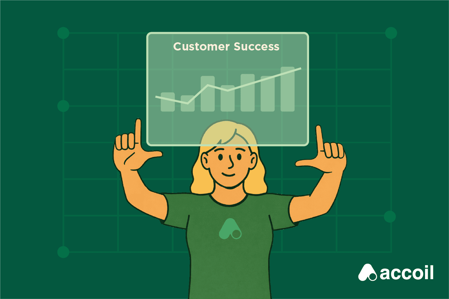
 Some tools will give you every filter under the sun. Others will show you what’s worth paying attention to. If you want to keep moving fast, look for the latter.
Need fast migration? Check out this guide.
Up next: We are going to do a deep dive into the alternatives to June
Accoil

Overview
Accoil is a purpose-built alternative for B2B SaaS teams — and for June users, it’ll feel like a natural progression. Where most analytics tools are focused on products and events, Accoil is focused on accounts and outcomes. It’s a customer health engine, not a general-purpose analytics sandbox. You won’t be handed a blank canvas — you’ll be given the metrics you need, already wired up to think in terms of activation, engagement, risk, and revenue.
If June was built to show you “how are my accounts doing?”, Accoil answers the same question — and then pipes the answer into your workflows.
Data Capture & Setup
Accoil is fast to set up. Connect a data source — Segment, RudderStack, API, or SDK — and it starts populating dashboards in minutes. You don’t need to predefine every event or build a tracking schema from scratch. If your data already includes things like user_logged_in or project_created, Accoil will recognize and categorize them intelligently.
It also connects directly to your go-to-market tools — Salesforce, HubSpot, Slack, and more. So when an account hits an activation milestone, drops off, or looks ready for expansion, you don’t need to check a dashboard — you get notified where you already work. Accoil doesn’t just store data — it delivers it into your workflows.
Out-of-the-Box Metrics & Insights
Accoil comes with prebuilt SaaS-native metrics like:
Activation Rate
Engagement Score (0–100, weighted by action value and frequency)
At-Risk Accounts
Power Users & Accounts
Account Retention Trends
And here’s the differentiator: you don’t need to analyze those charts to make sense of them. Accoil uses AI to generate written summaries of account health — so your team doesn’t have to do the interpretation themselves. Instead of asking “What changed this month?”, you’ll get a straight answer: “Account X’s engagement dropped 28%, driven by reduced usage of Feature Y.”
This lets CS and sales teams get up to speed on an account instantly — no digging, no dashboards, no analysis paralysis. You know what’s happening, and you can act.
Accoil also supports multiple engagement profiles out of the box — because “healthy” looks different for a free trial, a startup customer, or a large enterprise. You can easily define what good looks like at each lifecycle stage, and Accoil adjusts accordingly. It’s a flexible model, but the defaults are smart enough to work on day one.
B2B SaaS Fit
This is Accoil’s native environment. Everything in the product revolves around accounts — account filters, account-level scoring, account segmentation. You’re not hacking in group analytics — you’re starting from it. And with deep CRM integration, you don’t just see the health of your accounts — you sync it to the systems your GTM team already uses.
Accoil doesn’t just support B2B workflows — it was built around them.
Use Case & Team Fit
Accoil is for operators. It’s for CS managers, growth PMs, sales leaders, founders. People who don’t have time to dig into event explorers but still want to know exactly how things are going — and what to do next.
Instead of starting from scratch, Accoil gives you a clear picture: who’s active, who’s stuck, who’s drifting. If you want to dig deeper, you can — but you won’t need to in order to get value. And because insights are delivered directly into tools like Slack or Salesforce, you don’t need to train everyone on a new system — Accoil meets them where they are.
Pricing & Support
Pricing is transparent and startup-friendly. Support is hands-on: Slack channels, real people, real help. Accoil knows you’re likely switching from something that worked — and they make the transition smooth. Onboarding help, guidance on tracking plans, and fast feedback are all part of the experience.
Bottom Line
Accoil builds on the foundation June laid — fast setup, clear metrics, and a focus on B2B SaaS. But it pushes further into actionability: deeper integrations, richer account health models, and AI-generated summaries that save your team time. It’s not trying to be everything — it’s focused on helping go-to-market teams understand what’s happening and act on it.
If you’re replacing June and need a system that thinks in accounts, talks in plain language, and fits into your existing workflows, Accoil is a strong fit — especially if you want clarity without complexity.
Better Together: Why some teams pair Accoil with PostHog or Amplitude
If you were using June for both product analytics and customer health, you may not find a single replacement that ticks every box.
Here’s a pattern we’ve seen work well:
Use PostHog or Amplitude for product analytics. Layer Accoil on top for customer engagement and GTM insights.
Here’s how it works:
Accoil integrates cleanly with PostHog and Amplitude. You can send your event stream directly into Accoil — either in parallel, or through a connector like Segment or RudderStack. You don’t have to stop using your current tools.
Accoil interprets the same data differently. Where PostHog or Amplitude show you funnels and event charts, Accoil shows you health scores, activation trends, and risk signals — at the account level.
You get the best of both worlds. Use PostHog or Amplitude for exploration and experimentation. Use Accoil for visibility and action — and send those insights straight to Salesforce, HubSpot, Slack, or wherever your team works.
PostHog

Overview
PostHog is an open-source analytics suite built for teams who want control. It covers the usual product analytics use cases — funnels, retention, paths — plus extras like feature flags, session replays, heatmaps, and A/B testing. You can self-host it or run it in the cloud. Either way, it’s built for engineers who want flexibility, not templates. If you want a platform that does everything and lets you own the stack, PostHog’s got range.
Data Capture & Setup
Getting data in is fast. Install the snippet or SDK and PostHog will start auto-capturing user interactions — clicks, pageviews, etc. — without needing to define every event upfront. You can also pipe in data from Segment, RudderStack, or your backend directly. Cloud setup is easy; self-hosting is more involved, but gives you full control. Either way, you’ll get raw data quickly — but meaningful insights still take some work.
Out-of-the-Box Metrics & Insights
PostHog has improved here. You now get “Trends” suggestions and app templates for common use cases — like SaaS, mobile apps, and e-commerce. These help you get oriented and spin up useful dashboards. That said, you won’t get account-level health or churn risk dashboards. PostHog doesn’t auto-surface at-risk accounts or tell you who’s slipping. It’s still very much a toolkit — powerful, but DIY. If you liked June for its instant answers, this won’t be a straight drop-in.
B2B SaaS Fit
PostHog supports B2B use cases through its Group Analytics feature — but it’s a paid add-on, and even when enabled, it’s not exactly front and center. It lets you group users by account or workspace and run company-level reports. But this is still a power-user feature, not a native B2B experience. You won’t get a view of “how is this account doing?” without building it yourself. There’s no opinionated structure around account health, no CS-facing dashboard, and no CRM sync unless you wire it up.
Use Case & Team Fit
PostHog works best for technical product teams. Engineers and data-savvy PMs will be right at home. But for CS or sales teams, there’s a steep learning curve — no account dashboard, no clear engagement view, and no “just show me the top accounts” interface. You can build those views if you have the time. But out of the box, it’s not designed for non-technical users. Support is community-driven on the free/self-hosted plans, but if you’re on a paid cloud plan, you’ll get access to live support and onboarding help.
Pricing & Support
PostHog has a generous open-source offering — you can self-host it for free, with full access to core analytics features. For teams that prefer managed infrastructure, the cloud-hosted version includes usage-based pricing, which scales with events captured and features used. Some advanced features — like Group Analytics (for B2B), feature flags, and session replay — are gated behind paid tiers. The upside: you can start for free and upgrade as your needs grow. The downside: some of the features that make it compelling for B2B use cases come at a cost.
Support varies by plan. Self-hosted users rely on community forums and documentation, which is solid but asynchronous. Paid cloud customers get access to live support, onboarding help, and faster response times. Enterprise plans unlock more — including a dedicated support manager and priority assistance. Still, like the product itself, PostHog’s support assumes a technical audience. You’ll get help configuring things, but you won’t get hand-holding or strategic guidance unless you’re on a higher-tier plan.
Bottom Line
PostHog is a flexible, feature-rich platform for teams who want to own their analytics stack. It’s a strong pick for deep product analytics, experimentation, and teams who like to build. But if your priority is B2B customer insight — especially for CS, sales, or support — you’ll need to build that layer yourself or pair PostHog with a tool like Accoil. That combo gives you freedom to explore, plus the clarity to act.
Amplitude

Overview
Amplitude is a heavyweight. It’s the tool you get when you want to analyze everything — funnels, retention, cohorts, A/B tests, even predictive analytics — and you’ve got the team to build it all. It’s powerful, flexible, and built to scale. But it comes with complexity. This is a product analytics engine, not a plug-and-play dashboard. If your team’s ready to dig deep, it delivers. If you want fast answers, you’ll need to make them yourself.
Data Capture & Setup
Setup isn’t trivial. You’ll need to define your events, instrument your app (or pipe in data via Segment), and manually build the dashboards you care about. Amplitude gives you tools, not finished metrics. There’s no concept of “activated account” or “power user” unless you define it. The tracking schema matters, and small mistakes early on can ripple through your reporting. If you’ve got clean events flowing, great — but even then, turning data into insight takes time and someone to drive it. It’s not difficult, but it’s involved.
Out-of-the-Box Metrics & Insights
Amplitude doesn’t give you metrics — it gives you a canvas. You won’t see “Active Companies This Month” or “Accounts at Risk” unless you build them. There are templates and best-practice dashboards, and they help — especially for things like feature adoption and retention. But there are no built-in engagement scores, no churn signals, and no native account health views. You’ll be building those from scratch. Amplitude gives you the sandbox, the shovel, and the wheelbarrow. But the blueprint? That’s on you.
There are best-practice templates — but true customer health or account-level alerts require manual setup.
B2B SaaS Fit
Amplitude was built for B2C — and it shows. You can make it work for B2B, but you’ll need to bend it. Group Analytics (Amplitude’s way of tracking accounts) is a paid add-on, and even once it’s enabled, you’re still doing the heavy lifting. You’ll need to pass account IDs, model company-level metrics, and build your own dashboards. There’s no native account view. No drift detection. No CS-facing workspace that says “here’s how this account is going.” It’s technically capable, but not built with customer-facing teams in mind. If account health is a core part of your workflow, Amplitude alone probably won’t cut it. That’s why many B2B teams pair it with a second layer — like Accoil — to surface the insights Amplitude can technically calculate, but won’t show you without effort.
Use Case & Team Fit
Amplitude is built for product and data teams. If you’ve got analysts, growth PMs, or engineers who love diving into data, they’ll get a lot out of it. Everyone else? It’s a steeper hill. The UI is polished, but dense. Most teams end up with one or two power users building dashboards for everyone else. If your CS team was used to June’s instant clarity, they’ll need help here. Amplitude is brilliant for exploration — but not built for visibility across go-to-market teams.
Pricing & Support
Amplitude has a generous free tier. For early-stage teams, that can go a long way. But at scale, pricing moves fast — and it’s usage-based. That means more data = more cost. And even on the free tier, the people cost is real: instrumenting the product, building dashboards, maintaining data hygiene. You can do anything with Amplitude. But you also have to do everything.
Support is tiered. Docs, courses, and community are solid. But unless you’re on an enterprise plan, expect standard support — not a Slack channel or onboarding help. Larger teams do get solutions engineering and onboarding support as part of their package.
Bottom Line
Amplitude is the analytics engine you graduate to. It’s fast, powerful, and built for teams that want full control — and have the people to run it. If your product team needs deep insight into feature usage or retention patterns, it’s a great fit. But it’s not built for account-level health, customer engagement scoring, or cross-functional visibility. That’s why many teams budget for two tools: Amplitude for exploration, and something like Accoil for clarity — surfacing who’s active, who’s slipping, and what to do about it.
If your team has the muscle, Amplitude can take you far. If you just need signal — fast — it might not be the only thing you need.
Pendo

Overview
Pendo isn’t just an analytics tool — it’s a product experience platform. It tracks what users do and gives you tools to act on it: in-app guides, surveys, feedback collection, even roadmaps. For teams that care about both visibility and engagement, that’s a powerful combo. Pendo shows up in SaaS orgs where Product and CS work closely — and where nudging users toward adoption is just as important as measuring it. But with that breadth comes more surface area. You’re not just getting analytics — you’re getting a suite.
Data Capture & Setup
Pendo is easy to install — drop in the snippet or SDK and it immediately starts capturing page views and basic interactions. You can tag events retroactively through a visual interface, which makes it feel flexible. But to be precise: retroactive tagging only works if Pendo already recorded the raw interaction — it’s not true time travel. Still, this helps non-technical users track behavior without asking engineers for new instrumentation.
Analytics setup can be quick for straightforward use cases. Define the features or flows you care about, and start building views. But if you're using the broader platform — guides, feedback, CRM sync — setup gets heavier fast. Each module needs configuration, governance, and some training. Pendo does integrate well with Segment, Salesforce, and Slack, but higher-tier plans unlock the full capability. This is a platform, not a side tool — and the setup reflects that.
Out-of-the-Box Metrics & Insights
Pendo gives you more out of the gate than most. You get standard dashboards for usage and adoption, plus a Product Engagement Score (PES) — a composite metric based on adoption, stickiness, and growth. It’s automatic, and at a glance, you can see how each account is trending. Some PES customizations require enterprise plans, but the default score is available and useful.
There are also built-in widgets for feature usage, login counts, retention, and stickiness. If June gave you fast, opinionated insights, Pendo’s close — just with more knobs. The trade-off is that analytics depth is limited. If you want advanced funnel logic, SQL-style queries, or deeply custom metrics, Pendo won’t go that far. Many teams pair it with a data warehouse or a more powerful analytics layer for those jobs.
B2B SaaS Fit
Pendo fits B2B well. Accounts are native, not bolted on. You can track both User ID and Account ID, and metrics roll up accordingly. It was built with subscription businesses in mind — track engagement over time, monitor usage trends, and act when things slip.
This isn’t just about dashboards — it’s about action. You can build usage segments and use them to trigger guides or alerts. If your CS team wants to know who’s drifting and nudge them in-app, this is where Pendo shines. It’s less of a deep analytics tool, more of a product + engagement system for go-to-market teams.
Use Case & Team Fit
Pendo is built for PMs and CS teams — not analysts. The UI is friendly. Most metrics are high-level. Events can be tagged without code. That makes it approachable for non-technical users. But it’s still a big product. If you’re using analytics, guides, feedback, and more, expect to spend time onboarding your team. If you're just using analytics, setup is lighter — but still more than June.
If your CS or product team wants to measure usage, understand behavior, and drive adoption without waiting on engineering, Pendo delivers. If they want to slice every funnel by cohort and push results into a data model, it’ll feel limiting.
Pricing & Support
Pendo is expensive. You’re buying a platform, not just a tracker. Pricing scales fast with MAUs and features — especially if you want Salesforce sync, in-app messaging, or NPS surveys. And even at lower tiers, there’s a people cost: getting value from Pendo takes time and team buy-in. It can replace multiple tools — but only if you use it like one.
Support is solid, but structured. Big customers get onboarding and CSMs. Everyone else uses docs, community, and tickets. The enablement content is strong — blog posts, webinars, templates — but don’t expect a personal touch unless you're on a premium plan.
Bottom Line
Pendo is a solid choice if you want one system to track behavior and improve it. It’s especially well-suited to B2B SaaS teams who care about retention, onboarding, and driving adoption — not just measuring it. If you liked June’s focus on account-level insight, Pendo will feel familiar — just bigger and more configurable.
It won’t give you analyst-level control. But it will give your CS and product teams the tools to understand usage and act on it. If you're ready for a platform, Pendo can replace June and expand your reach. Just be sure your budget — and your team — is ready for the commitment.
Heap

Overview
Heap takes a different tack from most analytics tools: capture everything first, decide what matters later. Clicks, swipes, form submissions, pageviews — Heap records it all by default. No tracking plan required. You install the snippet, and data starts flowing. Then, when a product question comes up, you define the event, run the query, and get your answer — even if you hadn’t thought to track it in advance. That retroactive flexibility is Heap’s calling card. Over time, it’s added session replays, insight surfacing, and other tools — but the core idea hasn’t changed: you don’t miss data, you just have to make sense of it.
Data Capture & Setup
Initial setup is fast — install the snippet or SDK and Heap starts logging user activity right away. No code changes needed to capture clicks or pageviews. Defining meaningful events happens after the fact, through a point-and-click UI. Want to know when users clicked “Start Trial”? Just tag the button, and Heap can show you past usage — as long as the raw data was already captured.
If you were using Segment with June, Heap plays nicely: it can ingest custom events alongside autocaptured ones. That makes migration smoother. You’ll get immediate value for exploratory questions, like “what are users doing on this new page?” But if you want a structured dashboard — signups, retention, conversions — you’ll need to build it. Heap gives you the raw material. You define what it means.
Out-of-the-Box Metrics & Insights
Heap doesn’t come with a ready-made SaaS dashboard. There’s no “Active Companies This Month” or “Accounts at Risk” view out of the box. Instead, you’ll use its modules — funnels, retention, paths, engagement — to build your own reports. Heap has added features like automated insight surfacing (formerly Heap Illuminate), which can highlight correlations between actions and outcomes. It might show, for instance, that users who tried Feature X in week one retain better — without you needing to ask. That’s powerful. But if you want straightforward metrics — N-Day Retention, usage by account — you’ll be building that structure yourself.
This is Heap’s superpower and its challenge. It captures everything, but imposes no framework. That’s great for analysts, but less helpful if you’re not sure where to start. You’ll get infinite data points — and you’re in charge of drawing the map.
B2B SaaS Fit
Heap wasn’t designed with B2B in mind, but it can handle it. You can track Account IDs, group users, and filter reports at the account level. But accounts aren’t a native entity — there’s no default company dashboard, no health score, no drift detection. You can build charts per account, sure. But it’s manual. And there’s no CRM sync or alerting system unless you bolt one on. For product teams, Heap works. For CS or sales teams, it’s likely too raw without layering another tool on top.
If your goal is account visibility and health monitoring, Heap alone won’t give you what June did. But it could power that view in another system — like Accoil — by feeding it clean, complete usage data.
Use Case & Team Fit
Heap works best for product managers and analysts who like to explore. The UI is visual and relatively friendly — no SQL required. You can define events, build charts, and pull useful insights without being deeply technical. But because Heap captures so much, the interface can get messy without discipline. If no one owns event naming and organization, you end up with a swamp of “click_1234” events. Where June handled that curation for you, Heap expects you to do it.
Non-technical users can learn Heap, but it really shines with a power user in the loop — someone who understands the product and can shape the data into answers.
Pricing & Support
Heap offers a generous free tier, especially for startups, and paid plans that scale with usage and features. As with most tools in this space, support is tiered. Larger customers get onboarding and CSMs. Free users rely on docs and community. Heap’s documentation is strong, and they produce plenty of strategy content — naming conventions, analysis tips, webinars. You won’t get a Slack channel with their team unless you’re paying for it, but you won’t be left stranded either.
Bottom Line
Heap is for teams that want full visibility and the flexibility to define their own metrics on their own terms. If your frustration with past tools was “we forgot to track that,” Heap will feel like a safety net. The data’s there — you just have to organize it.
But that’s the catch. Heap gives you flexibility, not interpretation. If you want instant engagement scores, health trends, or GTM-ready insights, Heap won’t do that out of the box. It’s a powerful backend — just don’t expect it to speak in plain language without some help.
If you’re moving from June, Heap is a mindset shift: less “here’s the answer,” more “here’s everything — now define the question.” For teams that are ready for that, Heap delivers.
Mixpanel

Overview
Mixpanel is one of the originals in event-based analytics — launched in 2009 and still widely used across SaaS, mobile, and consumer apps. It’s a powerful, flexible platform for tracking funnels, retention, and user behavior. Over the years, Mixpanel has made real gains in usability, positioning itself as a more approachable option for teams who want serious analytics without the enterprise heaviness of Amplitude. Compared to June, Mixpanel gives you far more analytical power — but you’ll need to configure it yourself.
Data Capture & Setup
Mixpanel requires instrumentation. You’ll need to send events via their SDKs or a pipeline like Segment. If you were using June through Segment, switching that feed to Mixpanel is straightforward. Once the data is flowing, Mixpanel offers helpful templates — like “Activation Funnel” or “Retention Overview” — but you’ll still have to define what counts as “activated” or “retained” for your product.
Setup effort is moderate. You’ll want a clean tracking plan, and Mixpanel’s Lexicon helps with naming consistency. Getting started is easier than Amplitude, but making Mixpanel truly self-serve for non-technical users still depends on thoughtful upfront event design.
Out-of-the-Box Metrics & Insights
Mixpanel gives you basic starter dashboards — top events, retention curves — and in some plans, automated insight surfacing that highlights behavioral correlations (formerly offered via the now-legacy “Signals” feature). These tools can point to interesting patterns, but they’re still more “starting point” than “finished answer.”
You won’t get built-in customer health metrics, at-risk account alerts, or auto-generated B2B dashboards. Mixpanel gives you templates and modules — but you’ll need to define and build the business metrics you care about.
B2B SaaS Fit
Mixpanel supports B2B use cases through Group Analytics, which lets you aggregate user activity by properties like company_id. This is only available on Growth and Enterprise plans, and is a paid addon. Once set up, Mixpanel unlocks Company Profiles — dedicated views for each account showing company-level metrics like DAU, WAU, MAU, user engagement levels, retention curves, and more.
While Mixpanel now includes company-level dashboards, the platform still relies on you to define what “good” looks like. Health scoring logic, risk flags, or CS-friendly summaries don’t come out of the box. You’ll still be configuring views and creating dashboards to match your team’s needs — but the structure is much further along than it used to be.
CRM integration still isn’t native, but official and partner-built connectors exist for tools like Salesforce and HubSpot. These typically require configuration or third-party platforms — not a direct click-to-sync flow, but viable for most setups.
Use Case & Team Fit
Mixpanel is a strong fit for product and growth teams who want flexible analytics in a clean, modern UI. It’s easier to learn than Amplitude, and the built-in templates help teams get value without writing SQL. Non-technical users can run basic queries if the underlying data is well-structured, but this isn’t a “just log in and see the health of your accounts” experience like June. You’ll need someone to configure metrics, define events, and maintain dashboards.
Pricing & Support
Mixpanel offers a generous free tier, but Group Analytics and other key features for B2B usage are only available on paid Growth or Enterprise plans. Free plans are useful for early-stage product teams, but account-level reporting, advanced breakdowns, and exports are gated.
Support is tiered: smaller teams rely on docs and community, while higher-tier customers get onboarding help and a dedicated CSM. Mixpanel has strong documentation and a well-established community, so it’s easy to find support — just not the white-glove kind unless you’re paying for it.
Bottom Line
Mixpanel is a solid, flexible product analytics tool. It gives you the freedom to track and explore whatever matters — as long as you’re ready to define it yourself. Compared to June, it’s more capable but far less guided. Compared to Amplitude, it’s simpler and easier to use.
For B2B SaaS, Mixpanel can support account-level analytics — but only on paid plans, and as a paid addon. If you’ve got the tracking right and a team who can own the structure, Mixpanel’s a strong core to build on — just don’t expect it to deliver clarity on day one.