Sure, new bookings feel good, but the truth is your company's valuation is increasingly tied to Net Revenue Retention. When investors look at SaaS businesses, they're asking a simple question:
How well do you keep and grow the customers you already have?
That's why customer health monitoring has quietly moved from a nice-to-have to a frontline revenue discipline. Because by the time a customer churns, it's already too late. What you need are early warning signs, not a post-mortem.
A customer health dashboard gives you exactly that, tracking account-level behavior across product usage, support activity, and billing data to predict churn – so you can step in while there's still time to put things right.
Unfortunately, most teams start with spreadsheets. Data gets yanked from the CRM, usage exported from analytics tools, and everything duct-taped together in Google Sheets. It works… for a while. Then an account rebrands, a formula snaps, and suddenly your RevOps manager is spending five hours a week babysitting lookups that should've been automated months ago. That's usually the moment the penny drops: this setup isn't going to scale.
This guide walks you through how to build health dashboards that spot churn before it happens, using 90-day behavioral windows to flag risk early and prompt timely intervention. You'll see:
- Exactly which metrics matter.
- How to score and weight them on a clear 1–10 scale.
- And how to feed those signals straight into Slack and your CRM – without the pain, cost, or ceremony of setting up a full data warehouse.
Let's get started.
What customer health dashboards are and why they matter
A customer health dashboard gives you a single, real-time view of how each account is doing. It pulls product usage, satisfaction, support, and financial signals into one actionable score; so customer success teams can spot churn early and time expansion properly.
At their best, health dashboards tell you who needs attention today, and why, and what should happen next.
This is where they differ from customer service dashboards. Service dashboards focus on tickets, resolution times, and CSAT. Customer health dashboards go further, combining usage data, support signals, sentiment, and commercial indicators to surface retention risk and expansion opportunities at the account level.
A customer health score is the output: a single number or status (0–100, or red/amber/green) calculated from weighted metrics. The dashboard is the interface around it, showing trends, risk drivers, and recommended actions across many accounts – so teams can prioritize work and automate follow-ups without guesswork.
What working health dashboards deliver
Strong dashboards consistently show:
- Account name with a clear health score and color.
- A trend indicator showing recent direction.
- The primary risk factor in plain English, such as "Admin user inactive for 7 days".
- A recommended next step, like "Schedule CSM outreach".
Color coding does the heavy lifting. Red below 50, yellow between 50–79, green above 80 lets teams assess risk instantly. Trends matter just as much: a score of 70 falling from 90 tells a very different story than one rising from 50. Clear summaries spell this out – "Engagement down 15% due to declining admin activity" – so no one has to decode the data.
The best dashboards also route signals to the right people. High-value churn risks land with account executives. Adoption gaps go to customer success. Revenue signals drive action: seat usage above 80% paired with a renewal in 60 days flags the right moment for an expansion conversation.
Most importantly, health dashboards reduce churn by catching behavior changes while there's still time to act. Spotting a key user going inactive within 24 hours enables proactive outreach. Weekly spreadsheet updates leave six-day blind spots where disengagement quietly snowballs.
Get insights to predict churn within 48hrs
Accoil helps CS teams move faster by highlighting real behavior changes that matter for retention and expansion.
See how Accoil simplifies customer health →Why user-level analytics miss B2B churn signals
User-level analytics follow people, whereas B2B churn happens at the account level – that's where contracts are signed, renewals are decided, and revenue is won or lost.
User-to-account mapping breaks down when people cross organizational boundaries. A consultant working across two customers gets all their activity credited to the first account your system recognizes, making one account look healthy and the other invisible.
Domain quirks only add to the confusion: @acme.com and @acme-group.com show up as two separate "companies" despite being the same buyer. Track the wrong unit, and the warning signs fade out just when you need them most.
The failure modes that destroy dashboard trust
Black-box algorithms: If no one can explain a score to leadership during a renewal call, it's dead on arrival. "The algorithm said so" doesn't hold up.
Metric soup: Fifteen unweighted metrics leave teams guessing instead of acting. Without priorities or a single score, you're just left with more manual analysis.
Stale data: Weekly updates miss the power user who went quiet on Tuesday. By Monday, you're responding, not preventing.
The pattern is always the same: user-level tracking instead of account-level insight, opaque scoring, bloated metrics, and data that's already out of date. When dashboards stop earning trust, CSMs spin up shadow spreadsheets, and your "single source of truth" quietly stops being one.
Building a health score you can explain and defend
Start with the metrics that predict churn
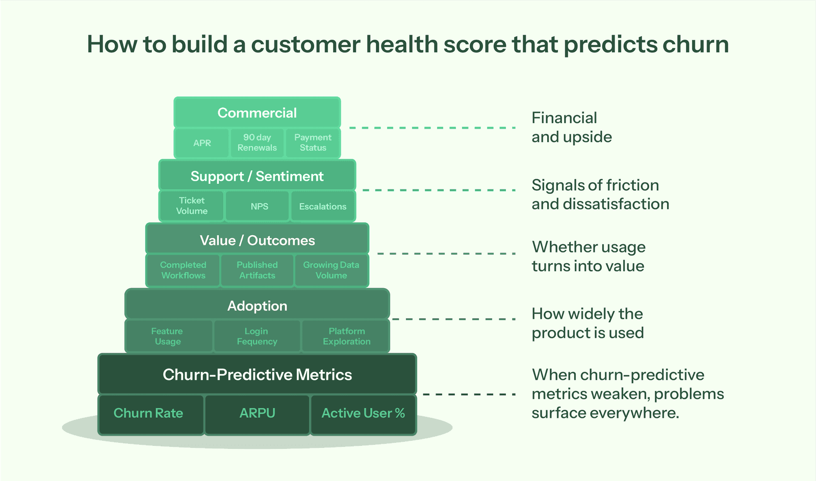
Begin with three load-bearing metrics:
- Churn Rate shows how many accounts you typically lose per quarter.
- ARPU (Average Revenue Per User) helps you decide which at-risk accounts need attention first.
- Active User Percentage shows engagement breadth – an account with 2 of 10 licensed users active is far riskier than one with 8 of 10.
Layer in supporting metrics across four dimensions:
- Adoption: feature usage, login frequency, breadth of platform exploration.
- Value/Outcomes: completed workflows, published artifacts, growing data volume.
- Support/Sentiment: ticket volume, NPS, escalations.
- Commercial: ARR, renewals within 90 days, payment status.
"Healthy" looks different for enterprise vs SMB. That means you need to use 90-day behavioral windows rather than 6–12 month views; recent behavior predicts churn better. Validate what actually predicts churn using your own historical data instead of borrowed frameworks. And before dashboards: get product instrumentation in place. If you're not tracking events, start there.
Combining digital vitals with human sentiment
Pull product analytics (usage), CRM (commercial), support (tickets), and billing (payments) into a single account-level view. Then, calculate weighted scores based on behaviors that predict retention for your business, normalize to 0–100, and trigger alerts when scores cross risk thresholds or drop quickly.
Automation tracks what users do; CSMs capture what users say. Add a manual Sentiment Score (1–10) owned by the account lead. Weight the Last QBR Outcome as a commercial signal to avoid data-only blind spots. If the executive sponsor just left, that qualitative signal matters as much as any usage metric.
Why one health formula fails a multi-segment business
-
High-Touch (Enterprise): prioritize depth of adoption across departments and executive engagement. Are they active in three departments, or just one?
-
Low-Touch (PLG/SMB): prioritize time to value and frequency of core feature use. Did they hit a meaningful outcome within seven days?
Set different normalization baselines so SMB accounts don't always look "red" next to enterprise patterns. A small team logging in three times a week can be perfectly healthy, even if that would worry you in enterprise.
Choose signals across adoption, outcomes, support, and commercial dimensions
You need four data sources:
- Product analytics like Segment, PostHog, Amplitude, or Mixpanel for usage events
- CRM systems like Salesforce or HubSpot for account data and renewals.
- Support tools like Zendesk or Intercom for ticket trends and satisfaction.
- Billing systems like Stripe or Chargebee for payment status.
Adoption signals show breadth and frequency. Value signals confirm real work via completed workflows and published artifacts. Support signals surface friction through ticket volume and escalations. Commercial signals flag renewal risk via ARPU tier, renewals within 90 days, and payment status.
Weight by value derived using a 1-10 scale
Assign event weights from 1–10 based on value delivered. Low-value actions like "Login" earn 1–2 points; high-value outcomes like "Published Form" earn 7–10. Use negative weights to flag acute risk: "Visited Cancellation Page" (-50) or "Exported All Data" (-50).
Normalize scores to 0–100 for clarity. Use the 90th percentile as your gold standard (100), apply an exponential spread, and measure over a 30–90 day window to keep signals fresh.
Get alerts in Slack and your CRM
Send Slack alerts when high-value accounts cross risk thresholds or drop 20+ points quickly. Sync health scores and risk flags to your CRM for sales visibility. Set thresholds carefully to avoid alert fatigue – most 5-point dips aren't emergencies.
Flag risk when scores fall below 50 and trend downward and hit specific triggers like "admin inactive 7 days." Spot upsell when scores exceed 75 with upward trends and expansion signals such as "seat usage above 80%" or "power users increased in the last 30 days." Always pair score thresholds with behavior and renewal timing to decide who needs attention today.
Use weekly digests for gradual shifts. Save real-time alerts for genuinely urgent changes.
Turn engagement data into clear priorities
With Accoil, customer health becomes practical: fewer metrics, clearer alerts, and confidence about who needs attention right now.
See how Accoil highlights risk and opportunity →Where teams start and when spreadsheets hit the wall
You probably don't have a data warehouse, but you still need to stitch together CRM, support, and product data somehow. So your team reaches for Google Sheets. You export accounts from Salesforce, pull usage from your analytics tool, download ticket counts from Zendesk, then start wiring it all together with VLOOKUPs.
At first, it works. Change a weight, and every customer score updates instantly. Manual joins give you visibility while you're still figuring things out. You can test what "healthy" actually means, try different weighting models, check whether scores predict churn, and tweak formulas freely without adding to your engineering backlog.
For the first quarter or two, spreadsheets feel sensible. You're moving fast, learning quickly, and not over-investing in tools you might outgrow.
The hidden costs when spreadsheets become your production system
Trouble starts when the prototype becomes the system. A RevOps manager on $120K spending five hours a week updating spreadsheets costs about $15K a year, and that's without accounting for the opportunity cost. That's five hours not spent on forecasting, pipeline analysis, or strategy.
Then things start snapping. An account rebrands from "Blank Inc" to "Blank Global," a lookup fails, and health scores drop to zero overnight. A CSM logs in to see their strongest account flagged as critical when nothing changed except the name. Error rates climb as formulas get overwritten when someone pastes data without using "paste values only".
As for version control – forget it. You've got "Customer Health Dashboard FINAL.xlsx," "FINAL v2.xlsx," and "Actually Final This Time.xlsx" scattered across drives. No one knows which one to trust.
When teams move from DIY to dedicated platforms
Engineering teams often underestimate the maintenance drag after the initial build. As data sources grow, so do edge cases – mergers, rebrands, schema changes. Dashboards get built once, then quietly decay as priorities shift. Someone renames an event, the dashboard breaks, and fixing it loses out to feature work.
You know it's time to move on when you spend more time fixing VLOOKUPs and mapping accounts than talking to customers at risk. At that point, your health dashboard shouldn't be a side project – it should be doing the work for you.
Getting account-first health scoring running with Accoil
Accoil was built for Seed to Series A companies by the team behind ThinkTilt, acquired by Atlassian in 2021. It connects to your existing stack – Segment, PostHog, Amplitude, RudderStack, or Mixpanel – without replacing anything. Setup takes minutes to hours, and signals start flowing within 24–48 hours. For security-conscious buyers, the platform is SOC 2 Type II and GDPR certified.
How account mapping and scoring work automatically
Manual mapping tables are out. Group calls from analytics libraries handle user-to-account links automatically. When your product sends a group call, Accoil keeps those relationships intact.
Rebrands don't break anything. Stable UUIDs preserve account identity, so when a company name shifts, scores stay intact.
Pre-configured 1–10 value-based weighting lets you move fast. You simply assign points to behaviors – logins (1–2), core feature usage (4–6), outcome events like "Published Form" (7–10) – and scores calculate automatically across all accounts.
Winsorized normalization at the 90th percentile with exponential spread keeps SMB and Enterprise accounts comparable, so smaller teams don't look unhealthy just because they generate fewer events.
Signals delivered where your team works
A daily Slack risk feed flags accounts that need attention. That means you don't have to deal with an extra dashboard login; you get plain-English summaries direct to where your team already works to explain what's happening: "3 of 5 licensed users haven't logged in for 14 days."
Health scores and risk flags sync directly into CRM records, so sales sees the full picture the moment they open an account. The Signals Feed shows how insights can be delivered into HubSpot, Salesforce, and Intercom where your team already is.
Start tracking health signals today
If you want to know whether your model actually works, compare predicted risk with real churn after 90 days. Then revisit and tune the weights quarterly, based on what genuinely drives retention in your business.
Spreadsheets are fine for sketching out scoring logic and pressure-testing different weights, but they quickly fall apart at production scale and can't support real-time alerts.
Once manual updates are eating up five hours a week, you've hit the point where a platform is cheaper than doing it yourself. The time saved in RevOps alone can justify the investment, before you even factor in the cost of missed interventions or expansion conversations that arrive too late.
Schedule a demo to see how health signals surface churn risk in your data.
Frequently asked questions
What are some popular software tools or platforms for creating customer health dashboards?
Popular platforms include Gainsight and ChurnZero. These are enterprise customer success platforms. They require $30K-$80K annually. They need complex implementation. Platforms like Vitally focus on mid-market teams. Accoil is built for Seed to Series A B2B SaaS teams with up to 100 employees. Product analytics tools like Amplitude and Mixpanel serve different use cases. They focus on analyst exploration at the user level. Customer health platforms focus on GTM team actions at the account level.
What's the process for building a customer health dashboard from scratch?
Building from scratch requires seven steps:
- Instrument product analytics to track key user actions.
- Map users to accounts via Group calls in your analytics library.
- Define healthy behavior by customer segment.
- Select 3-5 weighted metrics.
- Build normalization logic.
- Create alert thresholds.
- Integrate with Slack and CRM.
Internal builds typically require ongoing engineering maintenance. Data pipeline stability needs continuous attention. Scoring algorithm updates require regular developer time.
Are there any good templates for a customer health dashboard, maybe for Google Sheets or Excel?
Start with these columns: Account Name, Last Login Date, Active Users, Support Tickets, Weighted Score using SUMPRODUCT formula. Apply conditional formatting for red/yellow/green zones based on score thresholds. However, these templates break as you scale. Formula fragility causes errors. Manual update requirements consume hours weekly. Sheets work for prototyping the scoring model. They don't work for running it in production.