You're sitting on a mountain of data. Logins, feature usage, event streams – endless dashboards that should tell you everything about your customers. And yet, when the CEO asks, "Is Account X healthy?" the answer is still a well-informed shrug.
The uncomfortable truth is product analytics only tell you what happened, not who needs help or what to do next. And the hardest part is high user activity doesn't mean satisfaction. Someone stuck configuring a product for four hours will fire off plenty of events, but they're signalling friction, not success.
That gap between "we have the data" and "we know what to do" is where revenue quietly slips away. When you're managing 50, 100, or 200 accounts, intuition doesn't scale. Spreadsheets become archaeological digs. And by the time the warning signs surface, the customer has already checked out.
In this guide, we'll show you how to build a customer health score that predicts churn and expansion using data you already have. You'll learn:
- The four signal types that drive predictive health scoring.
- Why value-based weighting surfaces problems early.
- How to turn scores into actions your team will actually take.
- Why starting simple beats waiting months for the perfect model.
So, let's get you from guessing to knowing.
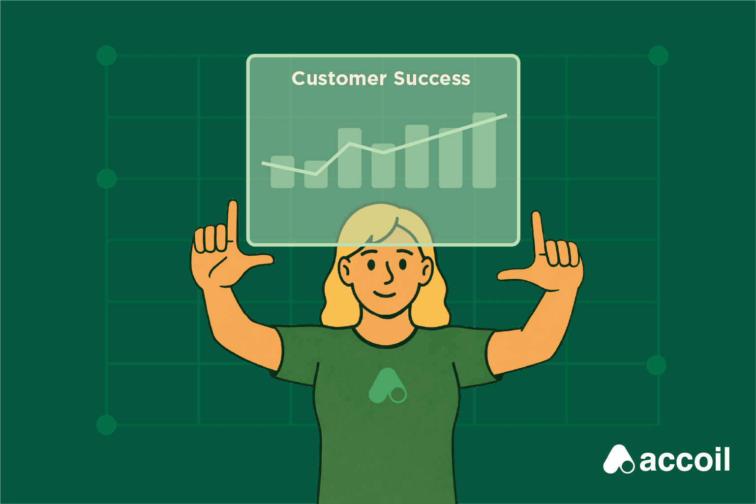
What customer health scores are
A customer health score is a predictive metric that combines product usage, support patterns, relationship quality, and financial signals to forecast whether a customer will renew. It's your early warning system; the difference between reacting to churn and preventing it.
In B2B SaaS, customer health reflects the relationship between an account and your product, not individual user activity. You're assessing whether an organization will renew, expand, or churn. That distinction matters: one disengaged user isn't a risk signal, but three inactive admins usually are.
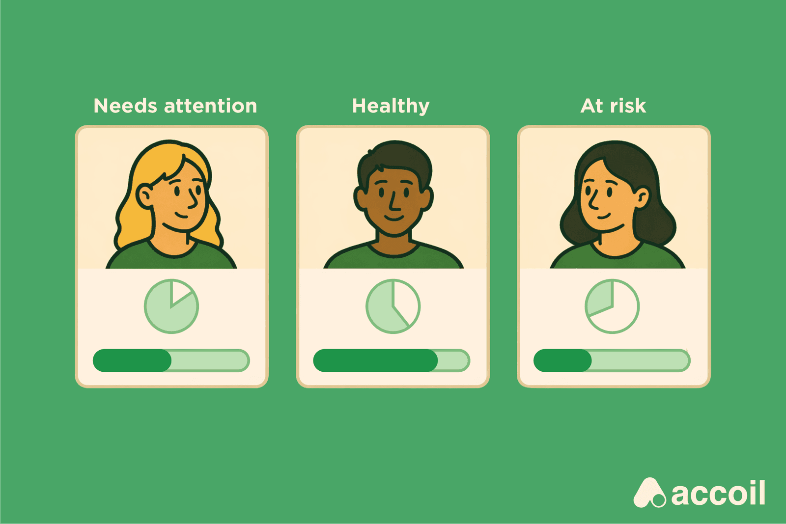
Most B2B SaaS companies group health into three bands:
- 0–40: Critical risk requiring immediate intervention.
- 41–70: Accounts that need monitoring and proactive engagement.
- 71–100: Stable retention with potential expansion opportunities
Your thresholds should reflect your own churn history, not generic benchmarks. A useful health score answers two daily questions: "Who needs help today?" and "Who's ready to grow?" It also lets you prioritize once your account list outgrows what you can manage in your head – typically around 20–30 accounts.
Why B2B health requires account-level thinking
B2B customers are organizations with many users, while product analytics track individual user events. You can't just count logins and call it health. Account health needs logic like "2+ admins logged in AND 50% of viewers used reports this week."
This is fundamentally different from tools like the Net Promoter Score (NPS). NPS captures sentiment at a single point in time – how someone feels today. Health scores track behavior patterns over time to predict outcomes. One measures mood; the other measures trajectory.
The three ways health scores fail (and customers churn without warning)
The most common mistakes are measuring activity instead of value, relying on static thresholds that trigger false alarms, and building models only data teams can interpret. Here's what that looks like in practice:
Green churn happens when high usage volume hides Power User disengagement. The dashboards look fine – logins are steady, events are firing – but the VP who championed the product stopped using it months ago. Junior staff keep clicking out of habit. You find out on the renewal call when they say, "Actually, we've been evaluating alternatives since October."
Alert fatigue sets in when threshold-based systems flag "usage down 20%" every Monday. After a handful of false alarms – Thanksgiving week, an all-hands offsite, that long July weekend – you start ignoring the alerts, and that's when a real problem can get lost in the noise.
Dashboard paralysis kicks in when health scores live in yet another tool. You log in, filter accounts, stare at charts, and try to remember whether 15 active users is good for this customer. It feels like homework. So it doesn't get done.
Why manual health scoring breaks down at scale
Many teams build health scores from data warehouse exports and SQL models, which puts customer success at the mercy of engineering bandwidth. Product changes break calculations. Fixes sit in a queue behind finance and product work.
That undermines the whole point of tracking customer health. Proactive retention is cheaper than replacing churned customers. Spot issues early and you can fix them before they're terminal. But if updating your health model requires a data team ticket, you're moving too slowly to save at-risk accounts.
Building a health score that tells you who's leaving and who's ready to grow
The signal types that matter (start with one, add more later)
Customer health scores typically draw from four metric categories:
- Product usage metrics track login frequency and depth of feature adoption.
- Support patterns measure ticket volume and resolution time.
- Relationship quality captures business review attendance and Power User engagement.
- Financial health monitors payment status and contract trends.
But the truth is you don't need all four on day one. Start with product analytics alone, then add support and relationship signals as you grow. Product usage data on its own is enough to create a credible health score this week. Additional sources improve accuracy over time, but waiting to collect everything just delays value you could be acting on now.
Clean, consistent data beats sophisticated models built on shaky inputs every time. If your event tracking is unreliable or support tickets are inconsistently tagged, adding more sources only compounds the problem. Get one data source solid before expanding.
How to transform raw signals into scores people understand
To calculate a customer health score:
- Collect metrics from your chosen categories.
- Normalize values so accounts of different sizes can be compared fairly.
- Weight each metric by importance.
- Aggregate the result into a 0–100 scale, and assign bands.
Normalization is critical because raw numbers mislead. A 10-person startup using your product deeply should be able to score 95 just like a 500-person enterprise. Without normalization, smaller accounts always look unhealthy simply because they generate fewer events.
Weight metrics by value delivered, not by activity volume. This is where many teams stumble. On a 10-point scale, logins might earn 1–2 points, while high-value actions – publishing content or integrating with other tools – deserve 7–9. A customer who logs in daily but never completes core workflows isn't healthy; they're stuck.
To set weights, review which behaviors preceded renewals versus churn over the last 90 days, then align scores to what you see. If customers who invited teammates in their first week retained at a higher rate, that action should carry real weight in your onboarding score.
Using drift detection instead of static thresholds
Health scores predict churn by tracking each account's normal behavior and flagging meaningful deviations weeks before blunt volume thresholds would. There's a big difference between "this account logged in 30% less this week" and "this account's primary admin hasn't logged in for two weeks, breaking an 18-month pattern." One is noise; the other is a warning.
Static thresholds create false positives around holidays and company events because they can't separate signal from background fluctuation – that's how you end up with alerts that fire every Thanksgiving, every December, every long weekend. After enough false alarms, teams stop paying attention.
For surfacing risk, it's more effective to monitor how quickly usage changes – velocity rather than volume. An account sliding from 80 to 70 to 60 over three weeks is clearly in trouble. An account that spikes from 60 to 75 for one week due to a campaign, then drops back to 55, hasn't actually improved despite briefly clearing a "healthy" bar.
For getting started, a simple onboarding model might look like this: core feature used (40 points) + team members invited (30 points) + weekly engagement established (30 points) = 100 points. But mature scoring layers in usage velocity, baseline comparisons, and segment-specific weighting. Accoil uses rules-based scoring so you can adjust logic without writing SQL or waiting on engineering.
Spot real risks and stop churn
Accoil separates genuine churn signals from normal usage swings, so your team stops chasing false alarms and starts acting on what actually matters.
See how Accoil detects real risk
Adapting models for different customer stages
Success looks different at week 1, month 6, and year 2. Early on, you need to focus on activation: key features used, setup completed, and initial value delivered. Are customers reaching the "aha moment" that makes the product stick?
For established accounts, watch adoption depth (advanced features used), feature breadth (how many areas of the product they depend on), and expansion signals (high engagement while nearing plan limits). A six-month-old customer using only basic features isn't quietly stable; they're a churn risk in disguise.
Health scores should update continuously, but human action needs cadence. Hold weekly reviews to discuss trends and assign follow-ups. Scores that drop 15 points in a week need immediate attention. Accounts trending upward deserve expansion conversations. The score shows you where to look; and the weekly review makes sure someone actually does.
Turning health scores into retention and expansion outcomes
Connecting score bands to specific playbooks
A health score without a playbook is just a number that raises your blood pressure. When a score drops into at-risk territory, you need a clear escalation playbook: executive review, root-cause diagnosis, and a recovery plan with defined milestones.
Risk band (0–40) requires immediate CSM intervention. Map every stakeholder, run a value-realization check, and work out whether the customer is stuck using the wrong features. This isn't a friendly check-in. It's surgery.
Watch band (41–70) calls for proactive outreach to surface blockers before they turn into churn. Share relevant success stories from customers who faced – and fixed – the same issues.
Healthy band (71–100) doesn't mean hands-off. Keep a steady engagement cadence, monitor for drift, and position renewals early. A customer moving from 95 to 75 in two weeks is sending a signal.
Three scenarios where health scoring prevents revenue loss
Silent churn happens when aggregate metrics mislead you. The VP who championed your product stops logging in while junior users keep running routine tasks out of habit. Event volume looks fine. Your health score spots what dashboards miss: the decision-maker vanished three months ago.
Expansion signals appear when smaller accounts hit 80% of plan limits with strong engagement. Health scores highlight accounts with high scores nearing usage caps, giving you the cue to start upsell conversations before constraints become friction.
This way incident response becomes targeted, not scattershot. After an outage affecting a specific feature, segment only the accounts that actually used it and run focused recovery outreach. You know exactly who felt the impact.
Push health scores into Slack and CRM, not another dashboard
Customer success teams don't live in dashboards. Push "who needs attention today" straight into Slack and CRM records where work already happens.
A useful health score view shows the score with a trend arrow, main risk factor, last engagement date, and a recommended next action – all in the CRM sidebar. Score changes should also land in the CRM timeline, showing direction and drivers, not just the latest number.
Context-rich alerts change the tone of conversations. Instead of "Just checking in," you lead with "I noticed reporting feature usage dropped 40% after you added three users – are they running into permission issues?"
When to split into multiple health dimensions
A single composite score works early on. Once you're managing more than 50 accounts, split into dimensions – adoption, relationship, and financial – for faster diagnosis.
High product usage paired with low financial health points to payment trouble before it hits support tickets. An active user with slipping payment patterns needs a very different response from one who pays on time but is disengaging.
Multiple scores let you answer "what's wrong?" in seconds instead of spelunking through one blended number. When you're triaging 100 accounts, speed isn't optional.
How to get from spreadsheets to trustworthy analytics scores fast
Start with the product data you're already collecting
Customer analytics platforms work well for early-stage teams. Full CS platforms are built for large enterprises (200+ employees with dedicated ops). Product analytics tools, meanwhile, still need analyst time to interpret. The real question is which category actually fits your stage and resources.
That gap is exactly what Accoil was built for: customer analytics for non-analysts. It turns the product data you already collect into clear, account-level health scores and daily signals for go-to-market teams, delivering practical insight from the events you're already tracking.
Connect to Amplitude, PostHog, Mixpanel, Segment, or stream events directly. Data starts flowing in under 24 hours, and most teams see engagement insights within 48 hours.
Get health scores without overhauling your CS platform
Accoil is built for teams that want trustworthy customer signals without the cost or complexity of enterprise CS software. Setup is fast, and insights arrive while the data is still fresh.
Build scoring that anyone can understand and adjust
Rules-based scoring lets customer success operations adjust weights and thresholds without waiting on engineering. If you learn that customers who invite teammates in week one retain 80% better, you can update that weight immediately.
Machine learning needs historical volume that seed-stage teams simply don't have, whereas transparent models earn trust faster because everyone can see why a score changed. When priorities shift, you update the logic in minutes; not after weeks of data team tickets sitting in a backlog.
Seven opinionated metrics designed for B2B SaaS outperform endless dashboard building every time. Most teams overcomplicate this, ending up with 40-metric models nobody trusts because nobody understands them.
Get signals that explain what changed and suggest actions
Accoil's Signals Feed flags things like "Account X entered risk segment," alongside the specific behaviors that caused the shift. Instead of guessing at a number the system tells you their primary admin stopped logging in and two power users went quiet.
Score changes and their reasoning land directly in CRM notes, rather than buried in dashboards. Automated drift detection spots slow disengagement patterns that static thresholds miss; like the gradual slide traditional alerts ignore until it's too late.
You go into calls informed, not investigating. "I noticed your team added five users last month but none completed onboarding" beats "Just checking in to see how things are going."
Purpose-built for early-stage teams without customer success operations
Pricing starts at $50/month with usage-based billing and no annual contracts, compared to enterprise platforms that start at $30,000+ per year. You're not paying for workflow automation you don't need or playbooks you won't use for another year.
SOC 2 Type II and GDPR compliant, even at startup-friendly pricing. Security reviews don't stall deals, and European customers don't trigger special data handling requests.
Get your first score running this week
You don't need to cling to spreadsheets longer than you should because health scoring sounds complicated. It isn't. You don't need a data scientist, a six-month rollout, or flawless data pulled from five different systems.
Starting with simple product usage tracking beats waiting on a perfect, multi-dimensional model that never ships. A basic score running today will prevent more churn than a sophisticated score you plan to build "eventually."
You now know what a solid health score looks like, which signals to start with, and how to tie it to retention and expansion playbooks. You understand why value-based weighting surfaces issues early, why scores need to live in Slack and your CRM where the team already works, and why drift detection outperforms static thresholds.
The gap between knowing and doing comes down to one decision: do you keep planning the "perfect" model, or do you put a score in front of your team that actually changes who gets called, saved, and renewed this quarter?
Schedule a demo with Accoil and we'll show you your data turned into live health scores your team can act on.